Illustration
Pictures, drawings, sketches and other such synonyms.
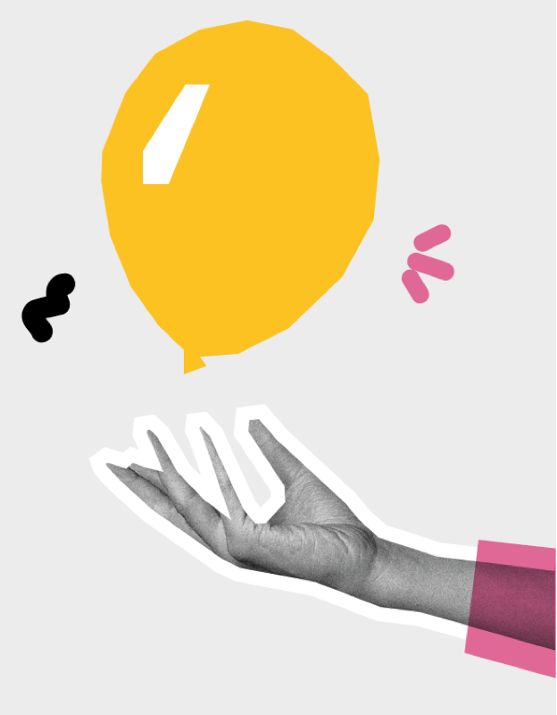
How we make them
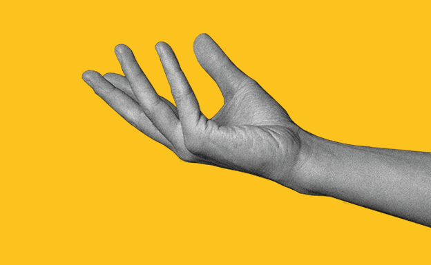
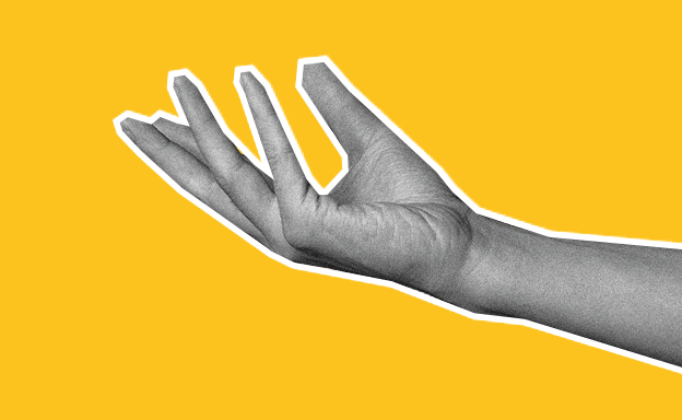
Our illustration style is based on black and white cut-out photography with a film grain filter.
The photography itself should have a cut-out feel with sharp, straight, white edges (never round) and a consistent width. Take a peek at the #choosegiffgaff campaign for an example.
All photography should be shot with contrasting light and have depth. We've moved away from using vintage archive images, they occassionally still crop up, but we'd prefer to stay away from them for the most part.
Add doodles and coloured shapes
When doodling, only create doodles in our primary colours and use marker pen strokes with a hand-drawn feel.
If you fancy, feel free to use colour shapes with a multiply blending mode, or a solid fill.
Use a maximum of 3 primary colours per image, as well as black and white.
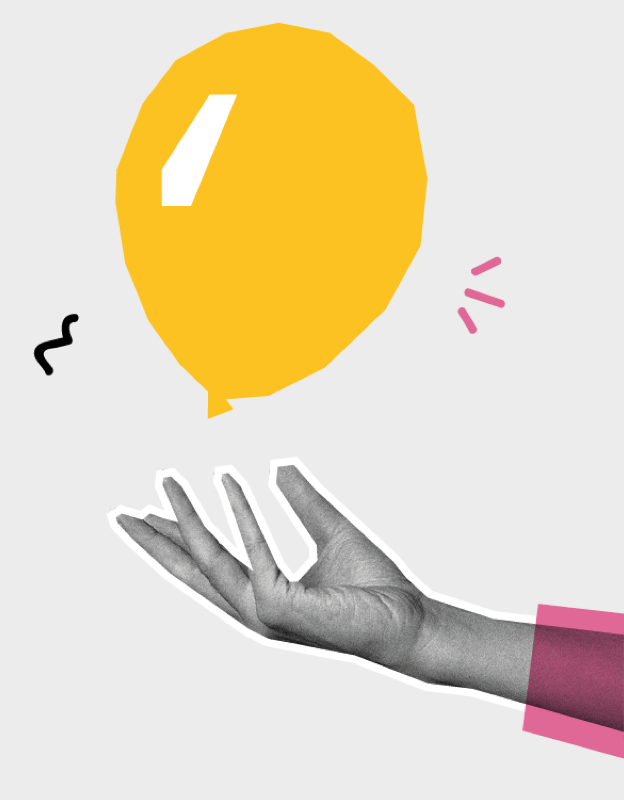
Doodle and outline thickness
White outline stroke width and doodle stroke width should be thick enough to be seen clearly relative to the illustration.
As a guide, if the image is 192px wide, then use a 2px outline and doodle thickness, for an image with a 312px width use 4px thickness, and for 504px width, use 6px thickness.
Exporting images for screens
Use the design system image size guidelines. Width and height should be one of our size values.